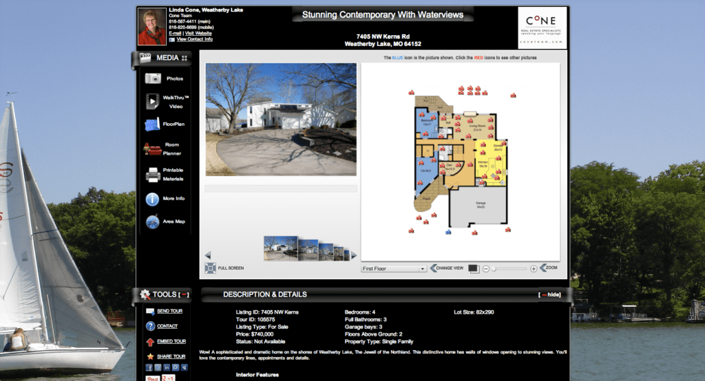
I am really excited to announce some cool updates to the Single Property Website Tour. Click here to see a sample tour.
Updates include:
- Centering of the tour on any web page (it used to be left justified)
- Better fitting of the content to eliminate scrolling of the main content area
- Cool wrap around styling of the content section headers
- Ability to change the overall background color…so now you have two colors to showcase your brand and enhance the look of the tour. It makes the content really pop!
- Ability to upload a background image – this could be the image of the property, a view of the area, or a custom branding image featuring your logo. For now, the custom background image only shows on the branded tour.
You can make these changes on a tour by tour basis, or in your profile to have them apply to all future tours.
A little tip. If you use Google’s Chrome browser, you can install a free “color picker” tool that allows you to get the color code for any color on any web page. Click here for a list of programs you can install for free to get the color code. Once you have the code, go to Edit Details on the Manage Tours page for a tour, or Edit Profile, and put the color either in the background 1 or background 2 spot. You can also do this for text. For example, this green is the color code #878f55
It is really simple to do and is another way you can really showcase your brand. The next training session will go over some advanced tour customization tricks. Click here to register…it is FREE!
 We would love to hear feedback….please comment or post something in our support forum.
